Product List by Category
Walgreens Adaptive Site: Customization of Tier 3 categories on product listing pages.
Client
Role
Research, UI design, Wireframes
Overview
With the wide range of products at walgreens.com, there is no ideal one-size-fits-all solution that works for all products. We wanted to reduce the visual clutter on the page by eliminating redundant or irrelevant information for an elevated browsing experience. We were asked to display product list page templates dependent on the category that the user is browsing.
Research + Discovery
I worked closely with the UX designer to perform competitive analysis and understand users' needs. Users browsing for cosmetics are looking for a different set of information than if they were browsing for lift chairs or vitamins. We analyzed hundreds of Tier 3 categories to determine which should receive a customized product card template. We narrowed it down to three categories: Beauty, High Price Point (lift chairs, scooters, etc), and High Involvement (vitamins, supplements, etc).
Wires
Challenges
A challenge for our website was the amount of information that was required on the product cards. We minimized the amount of information displayed where possible by removing any information that was not relevant to the category.
Implementation and Testing
QA Testing during development
A/B/C tested the Beauty templates
A/B tested the High Price Point templates
A/B tested the High Involvement templates
Results
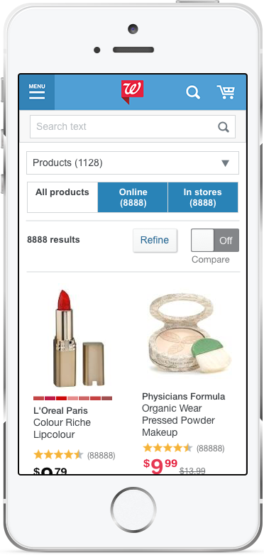
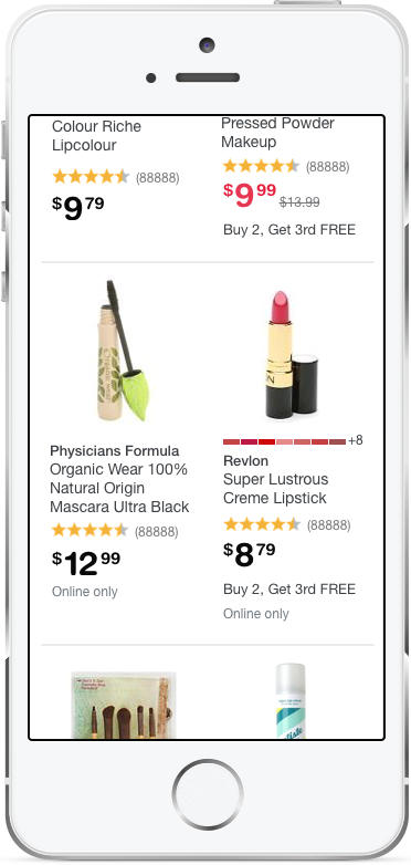
Beauty:
Grid view
One version without CTA buttons
One version where CTA buttons were hidden.
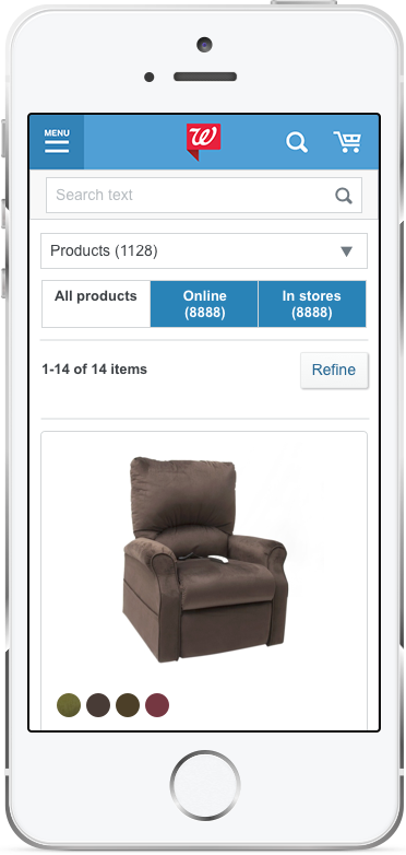
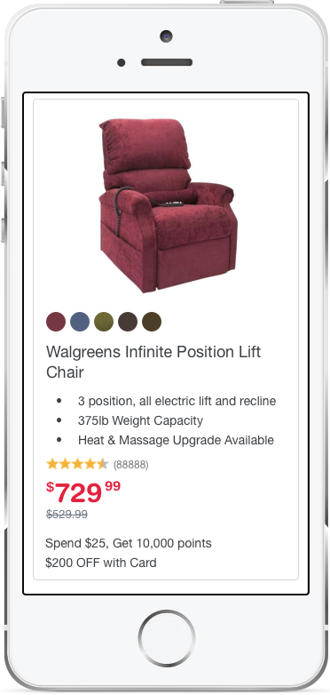
High Price Point (lift chairs, scooters, etc.):
List view
Added product features
Removed the CTA buttons
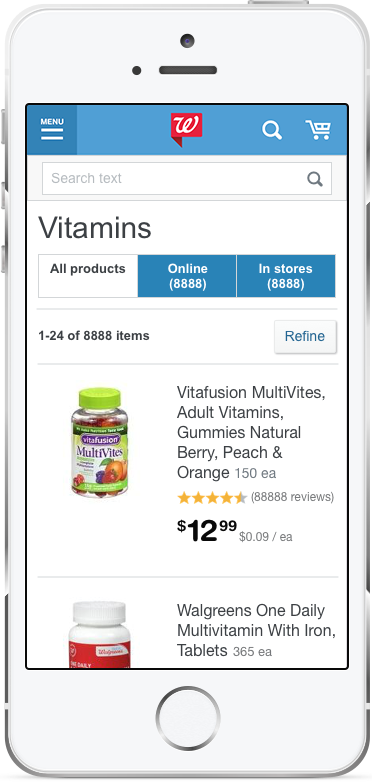
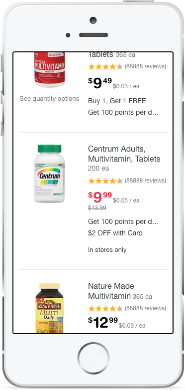
High Involvement (vitamins, supplements, etc):
List view
Added product features


